The Durham Voice
Challenge:
Optimize the news site's layout, navigation, and overall user interface to facilitate efficient access to relevant content and foster community connection.
Solution:
Conduct usability tests, develop personas, lead a card sort, create wireframes, and make informed recommendations to redesign the client's website.
My role: Usability testing, persona development, UX design, UX research
Timeline: Overall 8+ weeks, discovery & research 2+ weeks, design & testing: 6 weeks
Tools: Figma, InVision, UXMetrics, usertesting.com, Adobe Photoshop, Canva
Team: 9 UX designers/developers, 2 project managers
Usability Testing
Conducted listening sessions and identified pain points. Is the navigation setup helpful for users to find information? What accessibility issues exist? Does the organization of pages encourage readability and understandability?
Audience Analysis
Research based on local age, ethnicity, gender, education level, community type, values and news consumption trends in Durham, NC.
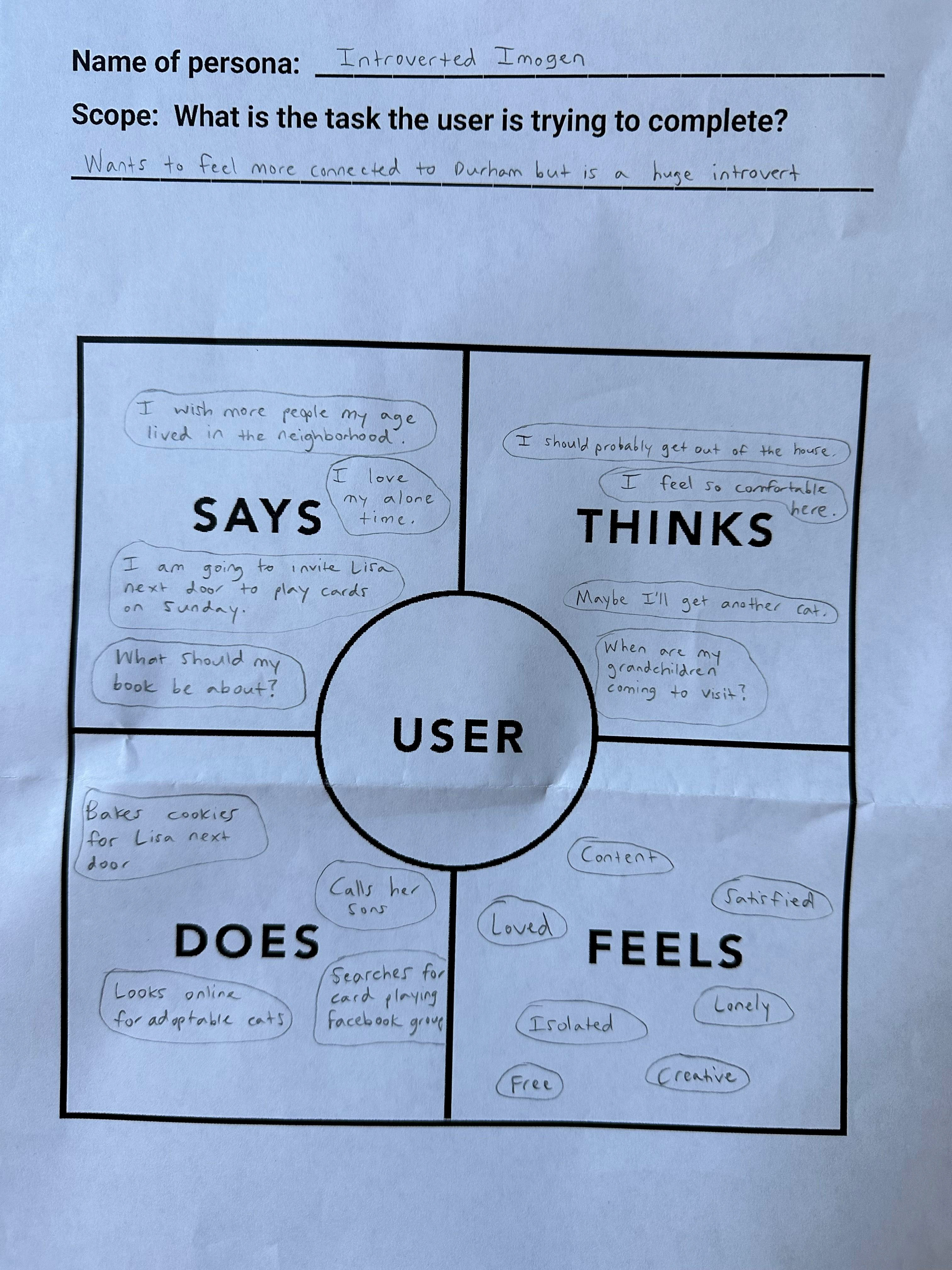
Empathy Mapping
What task is the user trying to complete at a particular stage in the journey? What questions do they have? These insights helped shape what users might look for on a platform like The Durham Voice.
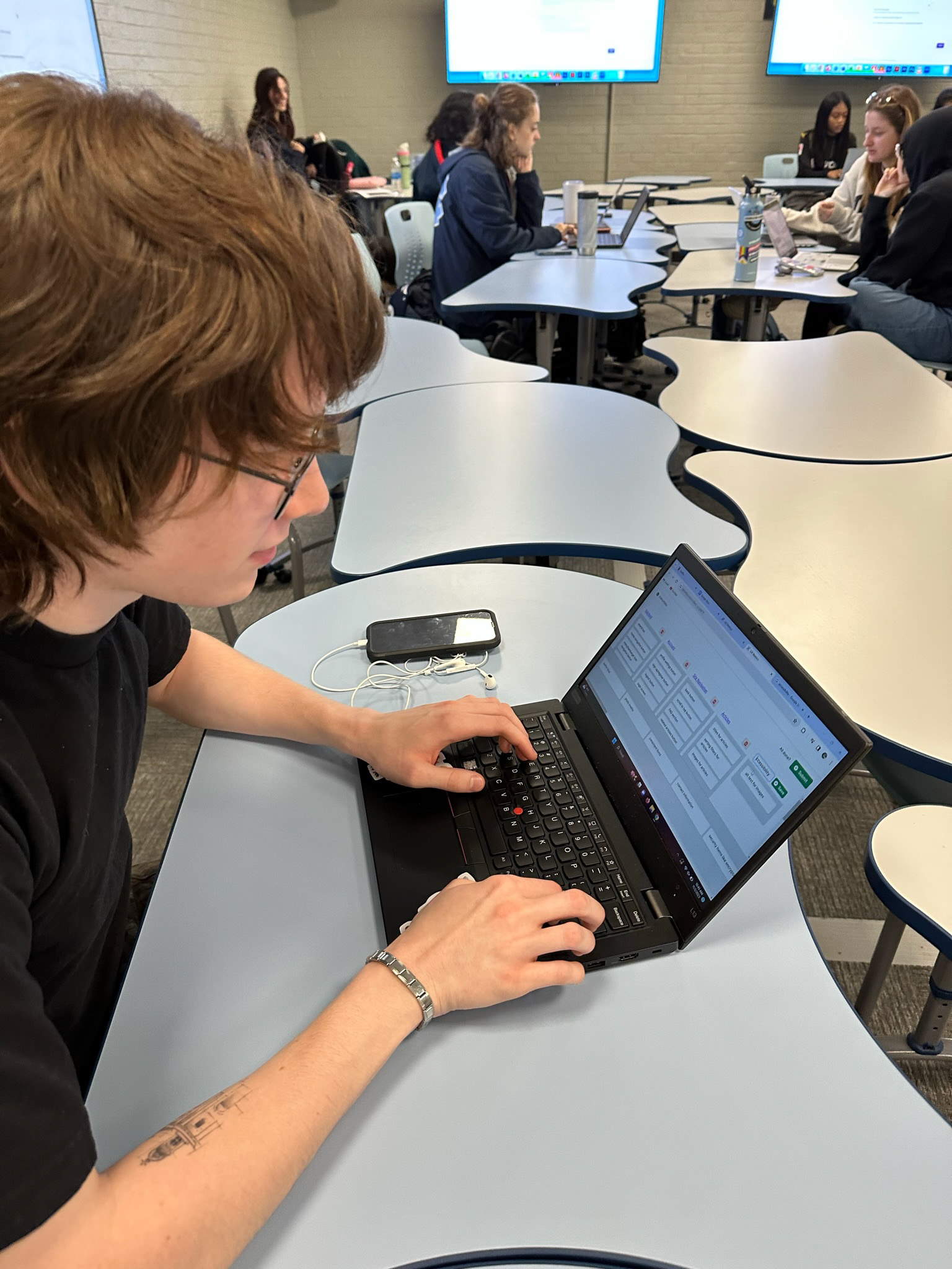
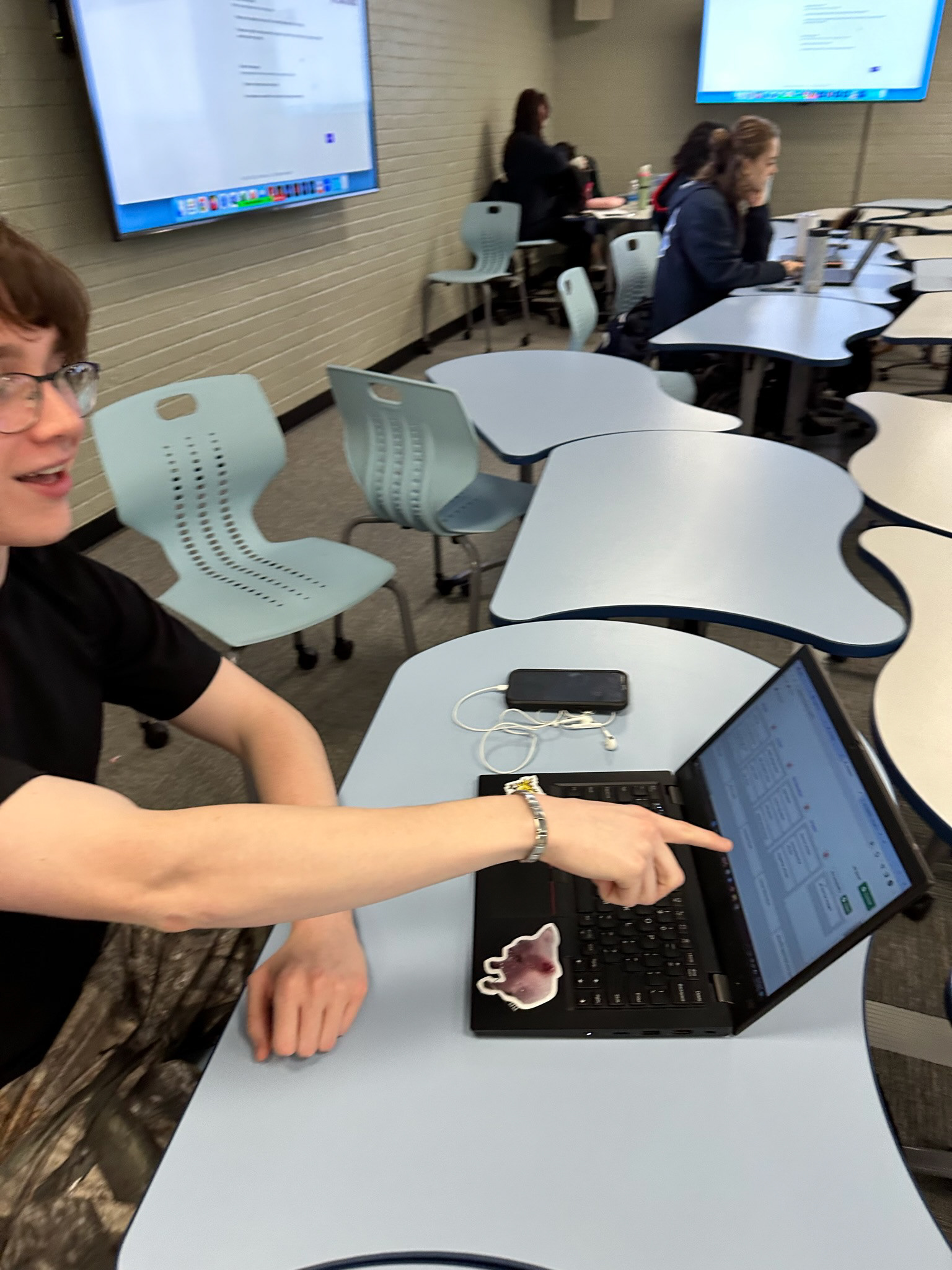
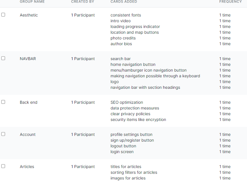
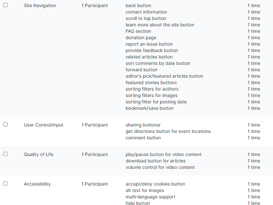
Card Sorting
I created 50 different cards with assets from The Durham Voice website in an online open card sort. The participants sorted them into groups that made sense to them (each labeled with a common feature or functionality). Our goal was to find smaller, intuitive groupings. I ended up with 9 clearly define main categories with 3-17 assets in each. What I learned from this process is that every user has a unique way of organizing different assets. Their process helped determine what an ideal structure and flow of the site might look like.
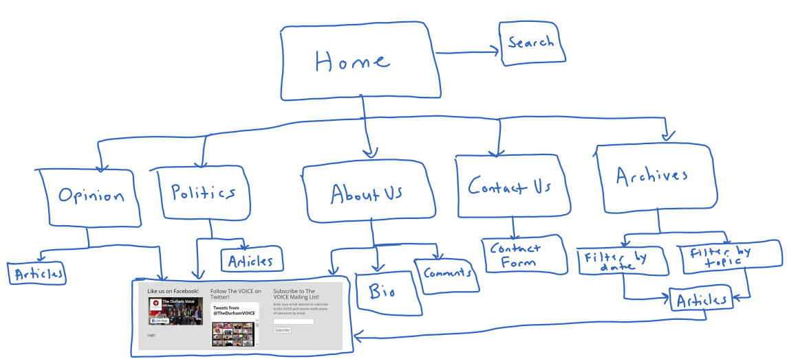
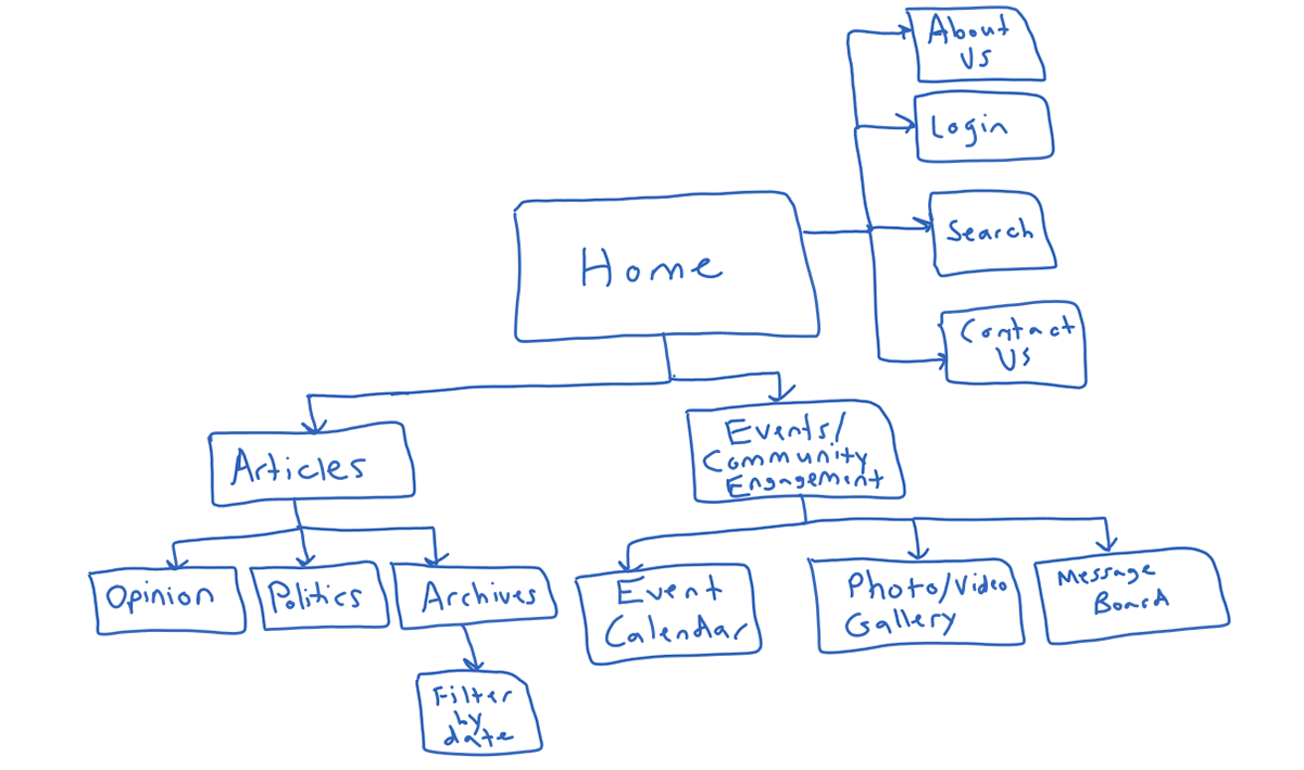
User Journey
We identified 2-3 unnecessary steps and potential drop off points in the original flow (left). By eliminating these from the new design (right), we ended up with a more intuitive experience that contributed to higher user satisfaction.
Low-Fidelity Wireframes
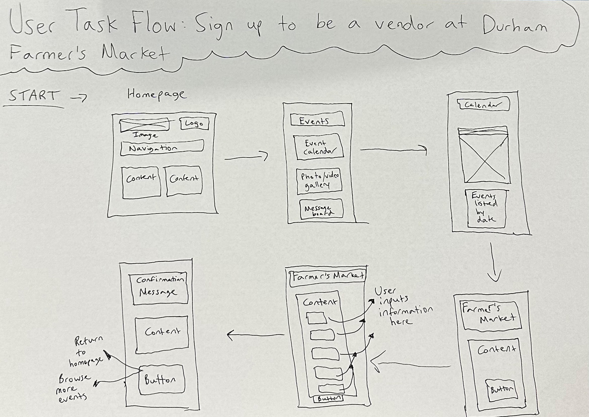
Mid-Fidelity Wireframes
High-Fidelity Mockup
Usability Testing Round 2
I submitted my high-fidelity mockup to usertesting.com for three additional rounds of usability testing. While some aspects of The Durham Voice's website usability were addressed in the initial prototype, there were a few more improvements to be made to ensure consistent fonts and UI elements. This second round of user testing demonstrates my commitment to understanding and acting on improvement suggestions.
What I learned & next steps
I completed a 16+ week-long iterative process. I learned the true importance of thinking through the perspective of the user. I gained insight into the different needs of people and what makes a website like The Durham Voice intuitive and valuable for them.